Building Slatewave: How I Designed a Color System That Works Across 31 Tools
The announcement post for Slatewave covered what it is: one palette, every tool I live in. At launch that was 20 themes. It’s now 31. This post is the part I find more interesting: how you actually build something like that without the ports drifting apart the moment you look away. There’s also a tier of standalone CLI tooling that’s interesting enough to deserve its own post, which is in the works. Everything else is here.
Why this is harder than it sounds
The naive version of “port a theme to 31 tools” is: pick some colors, copy the hex values into each tool’s config, done.
The problem is that every tool has a different model for what a “color” means. VSCode has ~500 named UI color slots and a separate JSON token-colors array for syntax. Oh My Posh has a per-segment background and foreground in YAML. Obsidian has CSS custom properties mapped to its own semantic variable names. Ghostty takes 16 ANSI color slots plus a handful of named keys. None of them are speaking the same language.
If you hand-match across all of those, you end up with 31 independent files that happen to look similar. The moment you want to adjust one accent (say, shifting rose slightly warmer) you’re doing it 31 times, by hand, hoping you catch every occurrence. You won’t.
The approach I took: define a single palette contract, make VSCode the canonical implementation of it, and derive everything else from that. There’s one file that’s the source of truth. Every other port asks what VSCode says and mirrors it.
Choosing the foundation
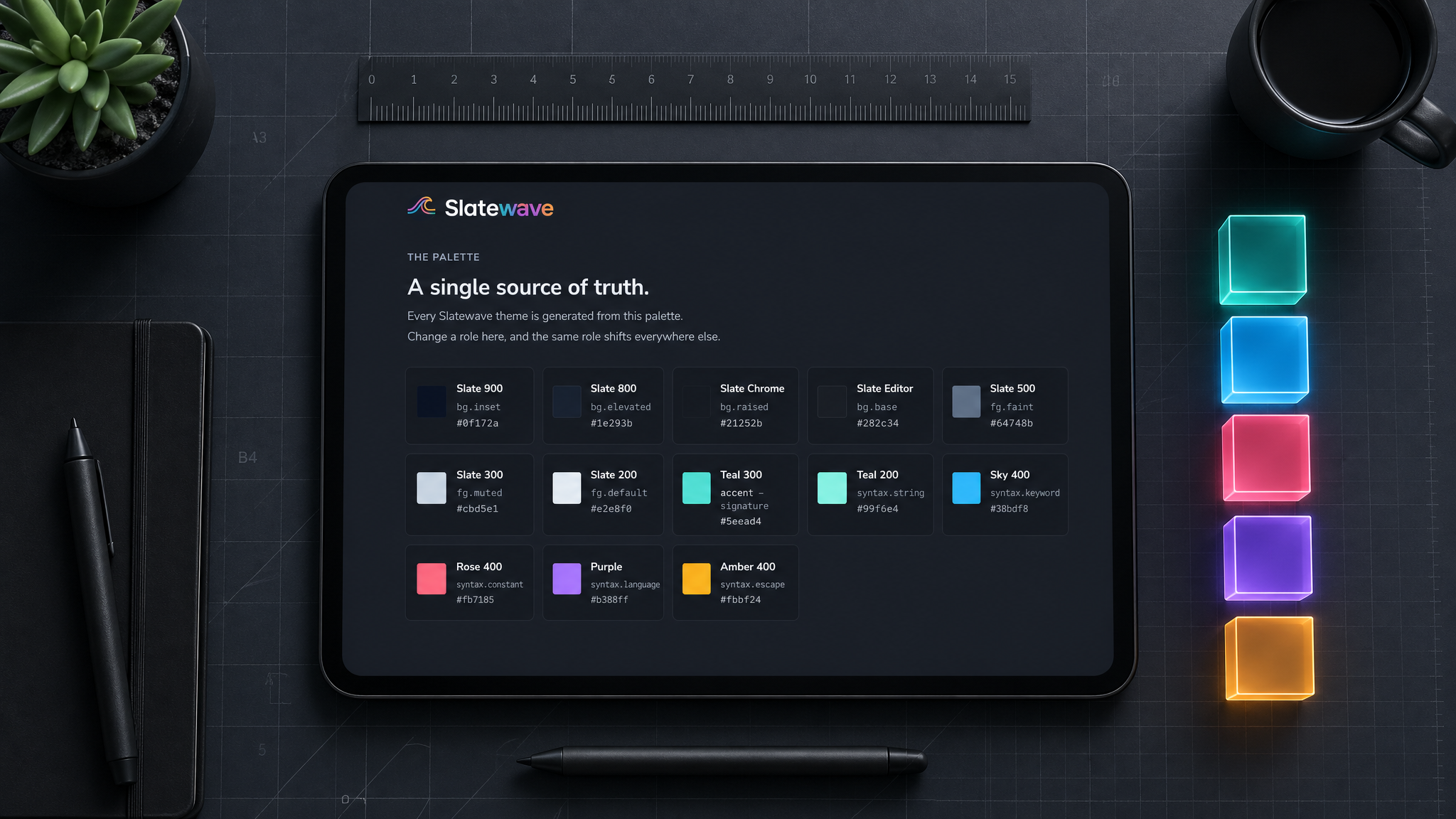
I wanted a background that was neutral. Not blue-shifted like Dracula, not warm-tinted like Solarized, just dark and calm. The Tailwind slate scale is that. It’s the kind of background you can stare at for eight hours without the color temperature starting to fight you, which is the whole point.
The surface ramp I use is:
#1e293b → deepest background (sidebar secondary)
#21252b → sidebar / activity bar
#282c34 → editor background
#2c313a → hover / embedded backgrounds
#334155 → borders, selections, panel headers
#3e4451 → inactive UI chrome
#475569 → muted borders
#64748b → faint text, comments
#94a3b8 → secondary / muted text
#cbd5e1 → primary body text (dimmed)
#e2e8f0 → primary text (full brightness)That’s twelve steps, which sounds like a lot until you try to theme an editor. VSCode has distinct slots for panel background, sidebar background, editor background, tab bar, input fields, dropdown lists, list hover states, and on and on. Without a ramp to pull from, you either use the same color for too many things (flat, indistinct) or eyeball a new one every time you need it, which is exactly how drift starts.
The slate ramp handles the structure. The accents handle the meaning.
The accent palette
This is where most theme decisions go wrong. A lot of themes pick accents for how they look in isolation: vivid against the dark background, good for screenshots. The problem is that once you have five accents in the same file, they compete. Your eye has no reason to read a purple built-in differently from a blue keyword if they’re both just “accent colors.”
I gave each accent a fixed semantic job before picking the actual hue, and then I held to it:
| Preview | Accent | Hex | Role |
|---|---|---|---|
| Teal | #5eead4 | Focus, CTAs, active state, strings | |
| Sky | #38bdf8 | Keywords, structural language | |
| Rose | #fb7185 | Errors, numbers, destructive actions | |
| Purple | #B388FF | Built-ins, language identifiers, template literals | |
| Amber | #fbbf24 | Warnings, decorators |
Teal is the signature accent. It’s the color that makes Slatewave recognizable, the brightest thing in the UI, used for the active tab indicator, focus borders, badges, the active sidebar item. In syntax, it lands on strings, which reinforces the “this is data, not structure” read.
Sky goes on keywords and storage: const, let, function, class, interface. The things that define what a statement is. Sky is slightly cooler and more recessed than teal, and that’s deliberate. Structure should be readable without being loud.
Rose on numbers and errors is a familiar choice, but the semantic grouping matters. A literal number (42) and a type error share a color because they’re both things that could be wrong or surprising at runtime. That’s not obvious until you see it, and then you can’t unsee it.
Purple on built-ins (this, self, super, import, require) separates language-defined identifiers from user-defined ones. This one took the longest to feel right. Purple is distinctive enough to signal “the language gave you this, not your code,” but recessed enough that it doesn’t dominate.
Amber is the warning color, and I used it sparingly: warnings in the editor, decorators and annotations, CSS pseudo-selectors. Amber is visually heavier than the others, so overusing it would unbalance the whole palette.
VSCode as the source of truth
The VSCode theme JSON has two sections: colors (UI chrome) and tokenColors (syntax). Getting the colors section right is mostly grunt work, mapping ramp values onto ~500 named slots. Getting tokenColors right is where the palette contract pays off.
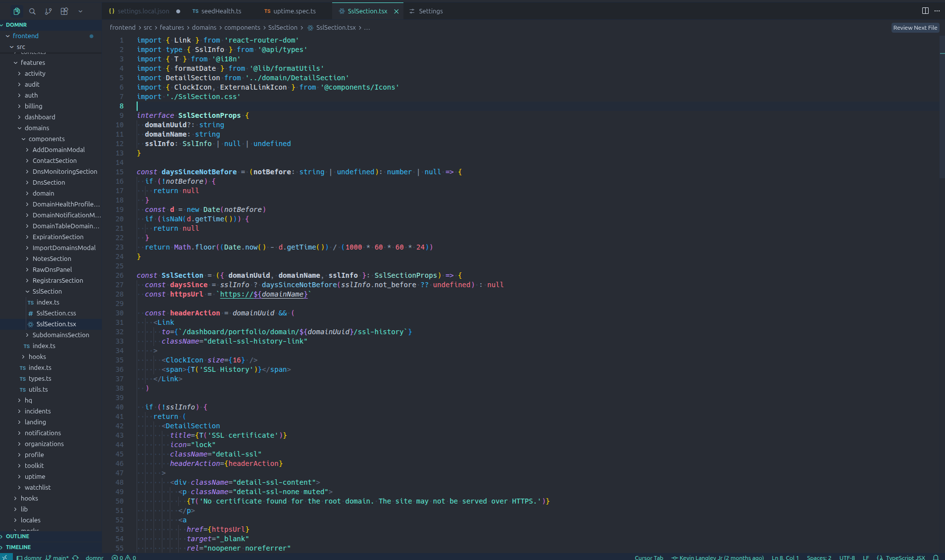
The token colors are what every other port derives from. Here’s a condensed version of the mapping:
"tokenColors": [
{ "name": "Comments", "scope": "comment", "settings": { "foreground": "#64748b" } },
{ "name": "Strings", "scope": "string", "settings": { "foreground": "#5eead4" } },
{ "name": "Keywords", "scope": "keyword", "settings": { "foreground": "#38bdf8" } },
{ "name": "Storage", "scope": "storage", "settings": { "foreground": "#B388FF" } },
{ "name": "Numbers", "scope": "constant.numeric", "settings": { "foreground": "#fb7185" } },
{ "name": "Built-ins", "scope": "variable.language", "settings": { "foreground": "#B388FF" } },
{ "name": "Functions", "scope": "entity.name.function", "settings": { "foreground": "#7dd3fc" } },
{ "name": "Types", "scope": "entity.name.type", "settings": { "foreground": "#99f6e4" } },
{ "name": "Errors", "scope": "invalid", "settings": { "foreground": "#ef5350" } },
{ "name": "Warnings", "scope": "keyword.other.mark", "settings": { "foreground": "#fbbf24" } }
]The full file has ~30 token entries covering HTML/JSX/XML tags, CSS properties, regex, decorators, operators, and punctuation. But these ten carry most of the weight, and they’re the reference table every other port maps against.
VSCode also supports semanticTokenColors, which is a more specific overlay that fires when a language server is running. I use it to distinguish type-checked constructs more precisely. For example, giving readonly variables a slightly different weight. The semantic layer only applies in VSCode, so it’s a bonus rather than something the palette contract depends on.
The fork dividend
The VSCode theme isn’t only a VSCode theme. The same JSON file ships as four separate listings: VSCode, VSCodium, Cursor, and Antigravity. Each one has its own install command and its own page on the site, but the underlying theme is identical. VSCode forks inherit the parent’s theming system wholesale, which means once the canonical file is right, you ship the others for the cost of repackaging.
The marginal cost of supporting Cursor was reading their extension docs to confirm they accept VSCode-format extensions (they do), then publishing under their marketplace conventions. Same for Antigravity. VSCodium is even simpler because it’s a binary-compatible build of VSCode itself.
I treat each fork as a first-class port even though the file is shared. The unit users actually care about is “install command per tool,” not “unique theme files in the repo.” Someone running Cursor full-time shouldn’t have to know that the right install command happens to be the VSCode one.
Native editor ports
The non-VSCode editors are where the contract gets tested. Each one has its own theming language, and the mapping work is real:
- JetBrains uses an XML-based
.iclsfile with attribute keys for every language plugin it ships. The IDE chrome and the editor are two different theming surfaces. - Sublime Text uses
.tmTheme(a property-list dialect) for syntax and a separate.sublime-color-schemeJSON for newer features. Both have to agree. - Neovim is Lua: you call
vim.api.nvim_set_hl()against highlight groups. Treesitter and LSP each contribute their own group namespaces. - Helix is TOML, which is the most readable of the bunch. Highlight names are scoped (
function.method,keyword.control), which maps cleanly to the VSCode token table. - Zed uses JSON with a syntax tree that’s almost a one-to-one with VSCode tokens. Easy port.
- Xcode uses
.xccolortheme(XML again), with a separate set of keys for source code vs. console output.
The pattern across all of them: read the tool’s theming docs, build a translation table from VSCode token scopes to the local highlight names, fill in the UI chrome from the slate ramp. The work is mechanical once you’ve done it twice. The discipline is refusing to invent new colors when the local theming language exposes a slot that VSCode doesn’t have. Better to repeat a ramp value than to widen the palette.
The ANSI constraint
Terminals are the hard case. Ghostty, iTerm2, Alacritty, kitty, WezTerm, and Windows Terminal all ultimately speak 16 ANSI colors: 8 normal + 8 bright. Your theme has to fit into that grid. Everything your shell or TUI renders in color gets mapped through it.
The 16 slots are named but the names are mostly historical. What actually matters is the mapping you establish between slot and meaning:
| Preview | Slot | Slatewave color | Semantic use |
|---|---|---|---|
| Black | #282c34 | Background elements | |
| Red | #fb7185 | Errors, deletions | |
| Green | #5eead4 | Success, additions | |
| Yellow | #fbbf24 | Warnings | |
| Blue | #38bdf8 | Info, links | |
| Magenta | #B388FF | Special, built-ins | |
| Cyan | #5eead4 | Accent, active | |
| White | #e2e8f0 | Foreground text | |
| Bright Black | #3e4451 | Comments, subdued UI | |
| Bright Red | #ef5350 | Strong errors | |
| Bright Green | #99f6e4 | Bright accent | |
| Bright Yellow | #f59e0b | Bright warnings | |
| Bright Blue | #7dd3fc | Functions, links | |
| Bright Magenta | #c4b5fd | Bright built-ins | |
| Bright Cyan | #a5f3fc | Bright strings | |
| Bright White | #f1f5f9 | Bright foreground |
The goal is that git diff in the terminal reads deletions in the same rose as a type error in the editor, and additions in the same teal as a string literal. When you’re context-switching between editor and terminal all day, that consistency saves your brain a small tax it was paying without you realizing.
Each terminal emulator is a flat config file. Ghostty is a representative example, one hex value per named key:
background = #282c34
foreground = #e2e8f0
cursor-color = #5eead4
selection-background = #334155
selection-foreground = #e2e8f0
palette = 0=#282c34
palette = 1=#fb7185
palette = 2=#5eead4
palette = 3=#fbbf24
...iTerm2 wraps the same 16 values in an XML plist. Alacritty and kitty use TOML and conf-style respectively. WezTerm uses Lua. Windows Terminal uses JSON. The format varies; the values are identical because the ANSI grid forces them to be.
Prompts layer on top
Once the 16 slots are pinned, the prompt sits on top of that grid. Oh My Posh, Starship, Powerlevel10k, and tmux configure their own segment-by-segment color choices, independent of the ANSI palette. Each prompt segment has an explicit background and foreground, which gives me more control: the git status segment can turn rose when there are unstaged changes and sky when you’re ahead of upstream, without polluting ANSI red and blue globally. Each of these tools has a different config language (YAML for Oh My Posh, TOML for Starship, ZSH for Powerlevel10k, conf-style for tmux), but they’re all picking from the same five accents and the same slate ramp.
There’s also a tier of standalone CLI tooling that paints its own output rather than reading the ANSI palette. That category turned out to be substantial enough to deserve its own treatment, and I’ll dig into it in a separate post.
Notes apps are different
Editor and terminal themes are optimized for scanning. Your eye jumps around, looking for structure. Notes apps are optimized for reading. Long paragraphs, headings, blockquotes, task lists. The same accent saturation that works in a code block can feel aggressive in a journal entry.
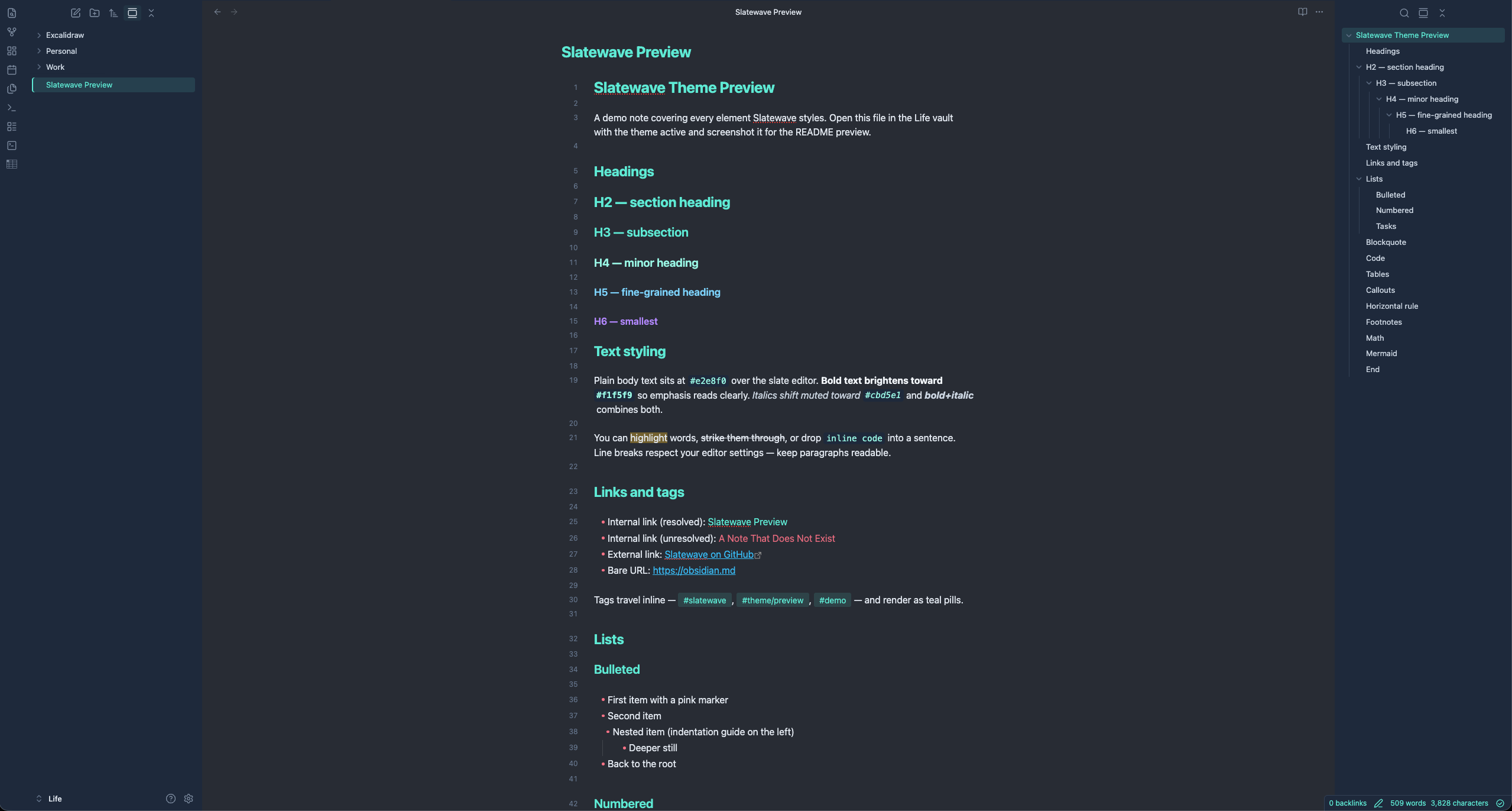
Obsidian uses CSS custom properties, which is the cleanest theming API of any tool I had to port to. You override variables in a .theme-dark {} block and Obsidian maps them through its own semantic layer. The Slatewave Obsidian theme maps the palette onto Obsidian’s variables, with a few deliberate adjustments:
- Body text uses
#e2e8f0(same as the editor), but links and accents are slightly muted. Teal at 80% rather than full brightness. - Headings use
#5eead4at lower contrast than in syntax. In prose, you want headings to organize, not shout. - The graph view uses the accent palette for node connections, which is one of those things that just works without any extra tuning.
.theme-dark {
--text-normal: #e2e8f0;
--text-muted: #cbd5e1;
--text-faint: #64748b;
--text-accent: #5eead4;
--text-accent-hover: #99f6e4;
--text-error: #fb7185;
--text-warning: #fbbf24;
--text-success: #5eead4;
--background-primary: #282c34;
--background-secondary: #1e293b;
--background-modifier-border: #334155;
}Logseq is also CSS-variable based and was a near-direct port. MarkEdit reads CSS too, with a slightly different variable naming convention. Anytype was the odd one out: it ships a theming engine that takes a JSON manifest mapping its own semantic tokens (like text-primary, bg-tag-blue) onto hex values. Once the mapping table existed, the port was straightforward, but figuring out the mapping took longer than the actual theme write.
Productivity apps and limited theming APIs
The productivity tier (Alfred, Raycast, Slack) has the least surface area and the most constrained APIs. You don’t theme these tools, you tint them.
Alfred lets you control every part of its result list: background, selection, subtext, hotkey hints. The Slatewave Alfred theme uses the slate ramp for chrome and teal for the selected row. Raycast is similar, with a smaller set of knobs. Slack’s theming API exposes about ten values: sidebar background, active item, notification badge, and a few others. You can’t touch message text or channel colors. The Slatewave Slack theme is more about making the sidebar feel like it belongs with the rest of the setup than achieving full palette coverage. It does the job, but it’s the most superficial port in the set.
These ports collectively took maybe an afternoon of work. The honest read is that they’re thin, but the value is consistency: when you cmd-space into Raycast or focus the Slack sidebar, you don’t snap out of the visual language the rest of the workspace is speaking.
Keeping 31 ports honest
The drift problem doesn’t go away when you have a source-of-truth file. It goes away when every port has a clear answer to “where did this color come from?”
For each theme, any color value should trace back to one of these sources:
- The surface ramp (structure, backgrounds, borders)
- The accent palette table (semantic color roles)
- A derived value from one of those (for example, teal at 30% opacity for selection backgrounds:
#5eead44d)
If a port has a hex value that can’t be traced to one of those three, it’s drift. During the initial build, I found a handful of places where I’d hand-matched something that looked right locally but wasn’t in the contract. A slightly different shade of slate in the Obsidian sidebar, a green I’d eyeballed for the tmux status bar, that kind of thing. Those got corrected by going back to the table, not by asking “does this look right?”
The other thing that helps: each port has its own repo, and the semantic role of each color is in the commit message or a comment. When I adjust the rose accent (say, because it reads too hot in some terminal emulators) I update the contract first, then update each port against the new value. The process is mechanical once the contract is clear.
At 31 ports, this discipline is the only thing keeping the project from collapsing into 31 themes that look vaguely similar but disagree on details. The contract is the project. The themes are just the contract rendered in 31 different config languages.
What I’d do differently
A few things came up while building this that I didn’t anticipate.
Functions vs methods. In VSCode, I’m using #7dd3fc (light blue, derived from sky) for both function definitions and method calls. They should probably be the same. They’re both callable things. But some themes distinguish them, and there are valid arguments for it. I haven’t changed it because the current read is clean enough, but it’s on the list.
The 16 ANSI grid is tight. Fitting five semantically distinct accents into 8 normal + 8 bright slots means making choices. Magenta carries built-ins in the editor, Bright Magenta carries a lighter variant, but in practice many tools render both as the same color. The semantic contract mostly holds, but the terminal is where it’s most compressed.
Productivity ports are the most superficial. Slack, Raycast, and Alfred have such limited theming APIs that the resulting themes are more about belonging-to-the-set than full palette coverage. They’re worth shipping, but I’d be lying if I said the contract gets the same workout there as it does in the editor or terminal.
If you want to see the full palette or grab any of the themes, getslatewave.com has install instructions for each one. The VSCode theme is the fastest install: code --install-extension kevinlangleyjr.slatewave. All 31 source files are in public repos if you want to look at how any specific port is structured.